Link-On Communications Adaptive Website
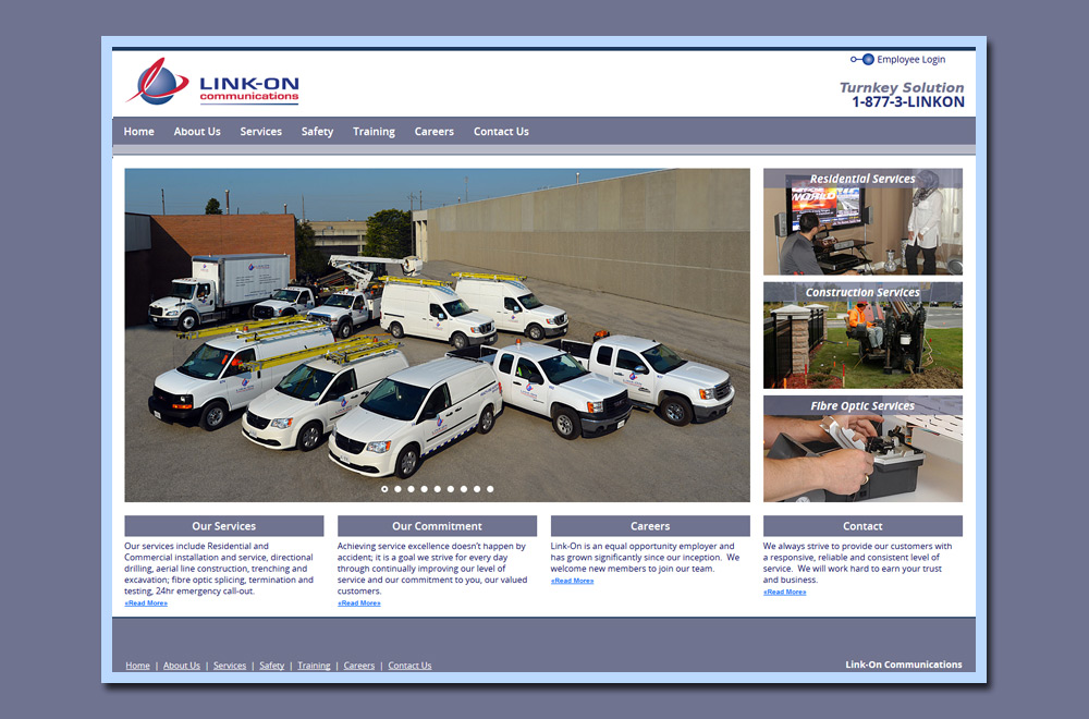
This is Link-On Communications’ second generation website www.linkon.ca produced by 17 Designs and it an adaptive website that makes use of @media queries to resize the website to fit different screen sizes (from mobile, tablet, notebook to large desktop). The site makes use of jQuery Banner animation. It includes an Employment Application and a full width menu that also resizes to fit any screen size. It was written using modular PHP components and HTML5 / CSS3.
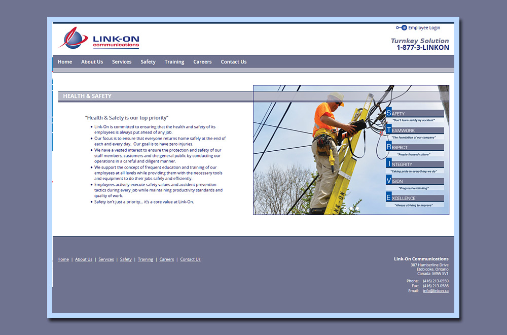
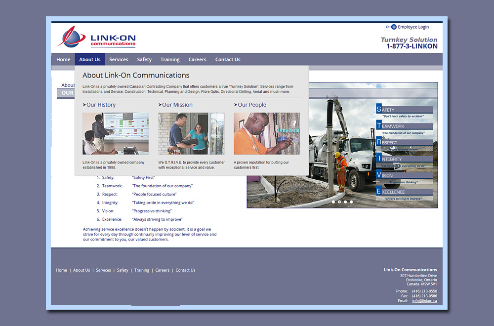
17 Designs also provided on-location digital photography of all photos used within this website. Photos were taken at actual job sites and in Link-On’s training centre.
To see more sites developed by 17 Designs please visit our Web Design Portfolio.