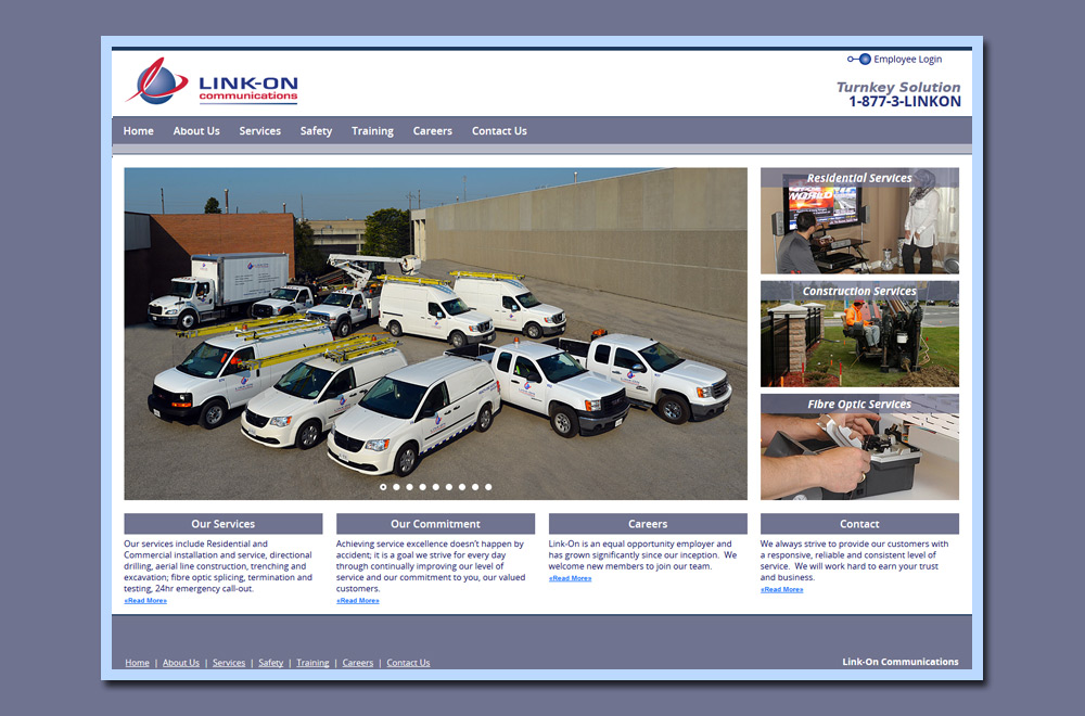
This is Link-On Communications’ second generation website www.linkon.ca produced by 17 Designs and it an adaptive website that makes use of @media queries to resize the website to fit different screen sizes (from mobile, tablet, notebook to large desktop). The...
Client name
Link-On CommunicationsSkills
PHP Web Development, Photoshop, Digital Photography, Web Design. Mobile-Friendly Website. Adaptive Website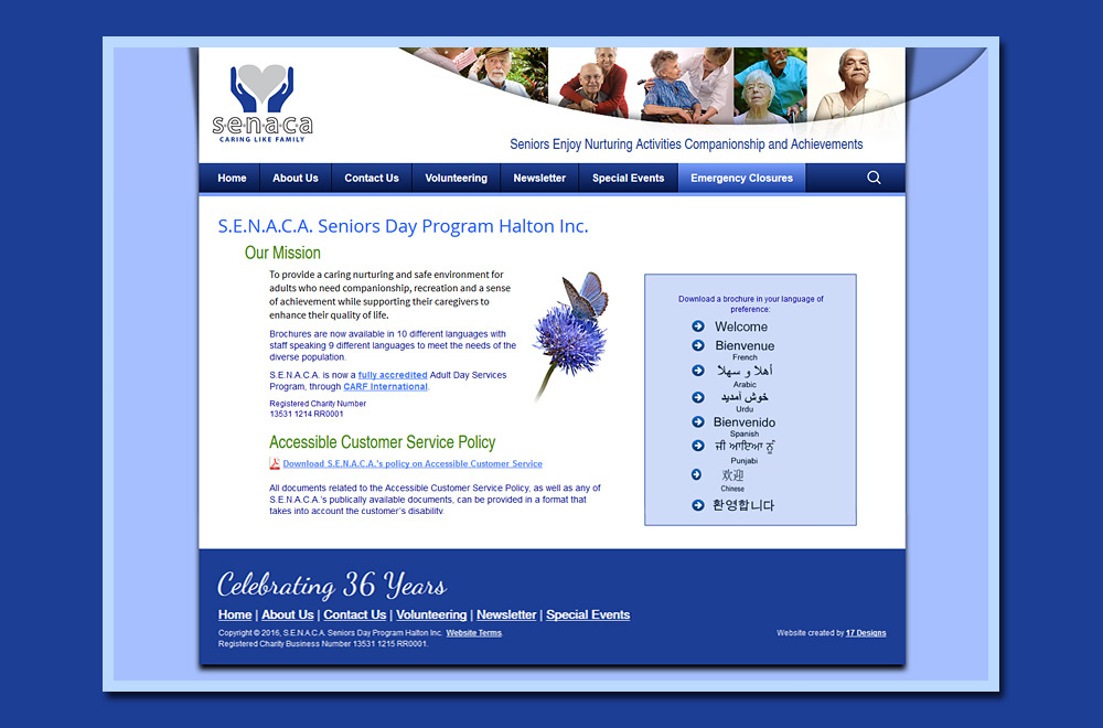
S.E.N.A.C.A. Seniors Day Program, a charitable organization funded by the United Way, hired 17 Designs to re-design their website www.senaca.ca using WordPress. The new site developed using an original theme just for S.E.N.A.C.A. is fresh, friendly and designed to appeal...
Client name
S.E.N.A.C.A.Skills
WordPress, Photoshop, CSS3 @media queries, mobile-friendly, adaptive website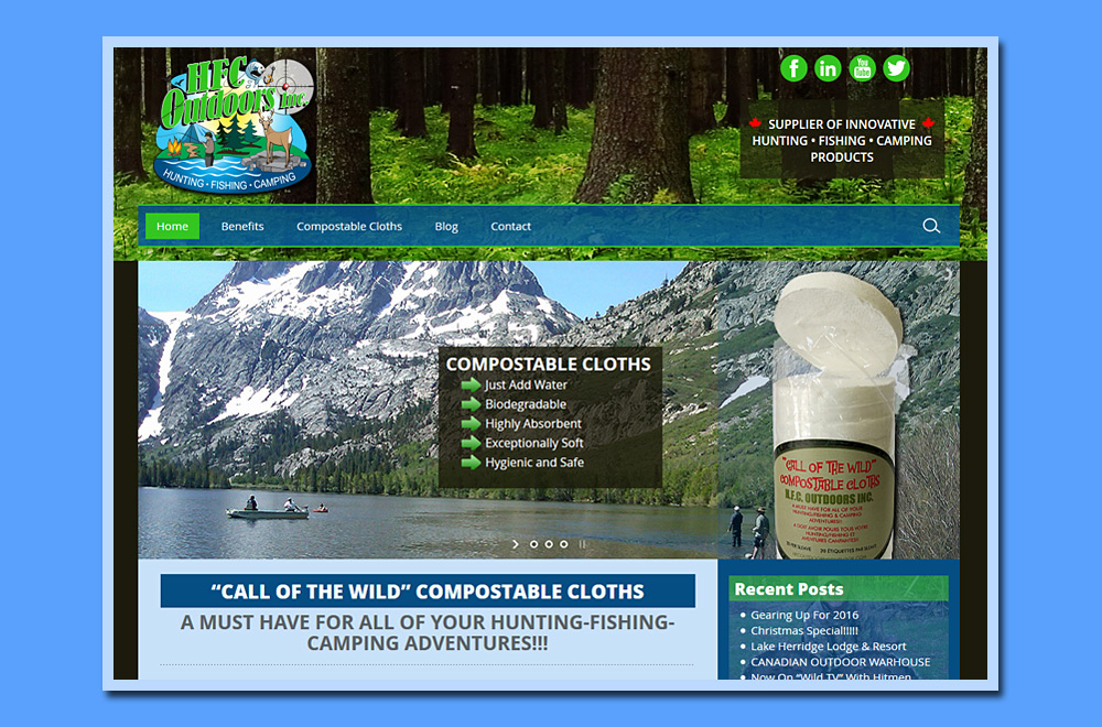
17 Designs developed this unique WordPress theme website www.hfcoutdoorsinc.ca for HFC Outdoors Inc. to showcase products suitable for hunting, fishing and camping. The site was developed with responsive technology and will adapt to fit any screen size. It includes an...
Client name
HFC OutdoorsSkills
WordPress, Web Design, custom WordPress theme, Photoshop, CSS3 @media queries, mobile-friendly, adaptive website, digital photography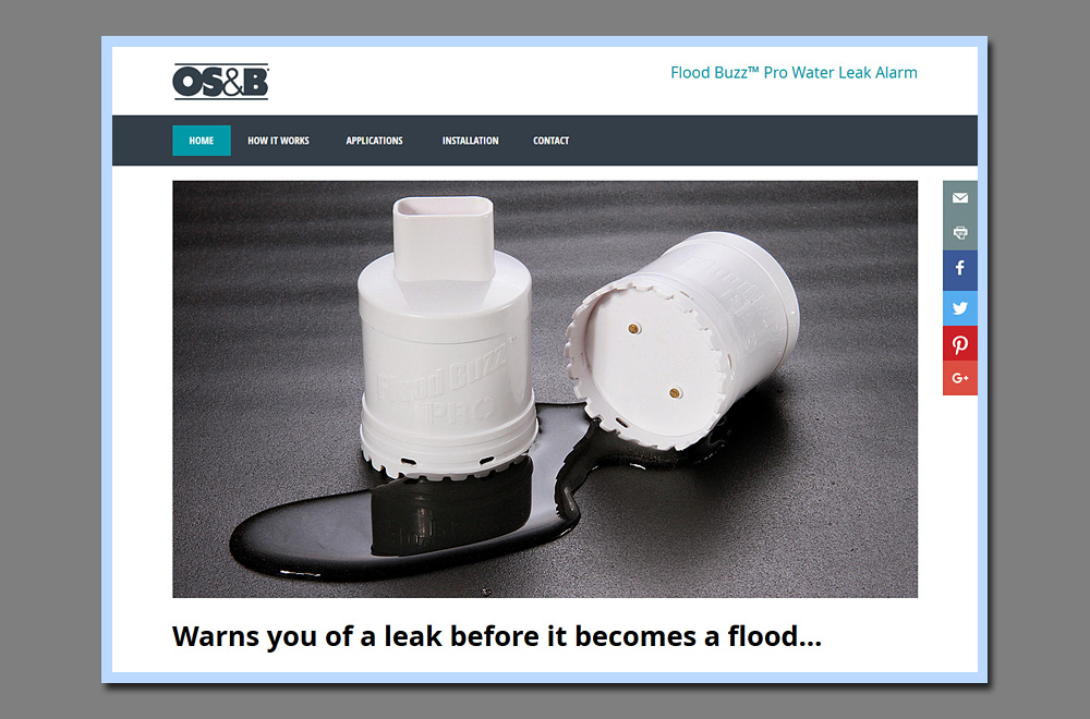
17 Designs developed this adaptive mobile-friendly PHP website in English and French to assist OS&B in promoting the new Flood Buzz Water Leak Alarm product to customers of the Home Depot. This website will detect for smart phones, tablets or...